
Square of Nine Roadmap Chart
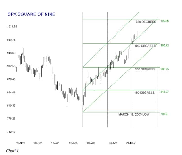
Let’s put our knowledge to work and create something useful, a Square of Nine Roadmap Chart. Chart 1 is a price chart of the daily high-low bars of the SP 500 (SPX) for the period from November ’02 to late May ’03. The low of the bar on March 12, 2003 was 788.90. The low close of the swing occurred a day earlier on March 11, 2003 at 800.73.
You can construct all the new Square of Nine stuff you see in Chart 1 on a simple price chart printed out from Excel or any of the dozens of technical analysis or stock charting programs or many stock charting web sites. Most of the illustrations in this book are produced from a software program I created to do the research for this book, but with a small amount of practice, you can produce a useful Square of Nine Roadmap Chart with a pencil and a straight edge. If you can print a plain bar chart of the SPX for the period around March 12, 2003 you can follow along with this example.
Calculating the Horizontal Price Lines
The two obvious structures that would not be present on the Excel chart are the vertical/horizontal grid lines and the trend lines, or as we will refer to them, the channel lines.
This is how to construct the horizontal grid lines.
Pull out your calculator and do the math with the square root of 788.9 and the factor for 180 degrees from the Degrees-Factor Table, and write down the first four or five 180-degree cycles up from the March 12 low of 788.9. Your worksheet will look something like this:
March 12 low of 788.9 = (SQRT(788.9) + factor) ^2
180 degrees (factor =1) = 846.07
360 degrees (factor =2) = 905.25
540 degrees (factor=3) = 966.42
720 degrees (factor=4) = 1029.60
Using the price scale of the chart you printed, draw four horizontal lines on the price chart at 846 through 1029, the price levels of the 180 degree rotations you just calculated. You will have completed the horizontal gridlines.
Calculating the Vertical Time Lines
The vertical gridlines are the time element of the Roadmap. You calculate the time element by taking the square root of the starting price of 788.9. The result is 28.08 which rounds to 28. Using a compass, the increments on your straight edge, or by any other method, mark off the distance of 28 bars from the last high-low price bar on the printed chart and draw a vertical line at that position. Repeat one or two times.
This completes the horizontal and vertical grid, and by doing nothing more, you will have mapped out likely key support and resistance prices for the SPX upswing from the March 12 low, but, of course, we’re not done yet.
Placing the Channel Lines
The lowest channel line is drawn by connecting a straight line from the starting point at 788.9 through the intersection of the first 180 degree horizontal line (846 on the chart) and the first 28 unit vertical line and extending it upward at the same angle through the other 180 degree intersections. The procedure for the middle channel line is exactly the same, but the starting point is the intersection of the first 180-degree horizontal line (905) and the same vertical position as the starting bar. The third channel line is done the same way one cycle higher (966).
If desired, you could add horizontal grid lines at the 90 degree price levels. They can be calculated the same way using a factor of .50 and its multiples, or you can simply split the difference between the 180 degree horizontal lines and draw the 90 degree lines there.
Why 90 degrees and why 180 degrees? The 90 degree angle (and its multiples, 180, 270, 360…) are very important in the stock market, particularly with daily and longer data. You will find that many, many swings and pullbacks are stopped dead on a 90 degree angle from a pivot top or bottom. We used a 180 degree angle, or more fittingly, a factor of 1.00, to construct this daily
chart of the SPX because that particular angle is what worked the best for the swing that started on March 12, 2002 from a price level around 800.
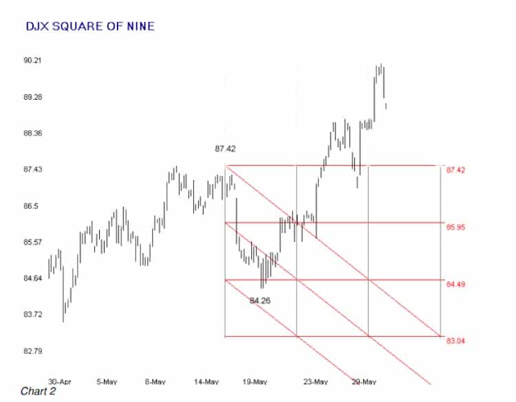
You do not yet have all the basic information that you need to use the Square of Nine Roadmap Chart as an application, but you will soon enough. Chart 2, below, is an hourly chart of the DJX from a period in May, 2003. The Hourly chart was constructed with 45 degree angles, or a factor of .25. Study the chart for a few moments before moving on to the comments below the chart.
Creating Hourly Roadmap Charts
Chart 2 was originally constructed in the late morning on May 16, 2003. At that time, all the price bars to the right of the leftmost vertical line (located directly under the 87.42 legend) were missing because they had not yet occurred. We had reason to believe at the time that this hourly pivot on the morning of May 16 could be a significant turning point.
Price action over most of the next two trading days seemed to confirm our outlook. The bounce off the 84.49 horizontal line was not unusual and could have been expected for a couple of reasons. One big reason was that 84.49 is 90 degrees down from the suspected pivot high at 87.42, and you should always expect some sort of reaction at 90-degree angles from a major or minor pivot.
The second reason was that the bounce occurred at a square’s mid-point. Not nearly as important as the expected reaction on a 90-degree line, countertrend moves have a tendency to start and end at the midpoints of the price and time squares. (Note: if you are doing the math, jump to page 16.)
The tip-off that something was seriously amiss with the bearish outlook was the penetration of the upper channel. We call this style chart the Square of Nine Roadmap Chart because price stays within the upper and lower channel bounds for days, weeks or even months from a major turning point. Naturally, the shorter the time period of the data in the chart the more likely price is to exceed the outer channel bounds as trend and countertrend moves work themselves out within even bigger trends.
When the upper channel bound was penetrated on the close for two consecutive hours it was time to close shorts and construct a new 45 degree Roadmap chart from the suspected pivot low. Chart 3 below was started from the May 20 pivot low after it became clear that the suspected downtrend had busted.
One practical advantage of the Roadmap chart is that it can be constructed, channels and all, the moment that a suspected pivot occurs. The Square of Nine Roadmap chart self-confirms the trend in progress by subsequent price movement remaining above the lowest channel bound in an uptrend and below the highest channel bound in a downtrend.
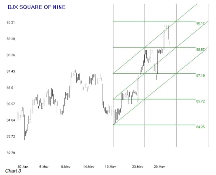
Chart 3 provides more useful information about the value of the Square of Nine Roadmap Chart as a legitimate trading tool. If you were long off the May 20 low you could stay comfortable with the fact that price was remaining well above the lower channel bound. Reactions were occurring, as is normal and expected, contained within the 45 degree squares. At the time this is being written we do not know if the 2nd rotation of the 90 degree level at 90.17 will stop the move or if it will hit the wall at a higher level.
The outer diagonal channel line is the most reliable price target that will likely turn back a rally or stop a down move. The horizontal price lines often provide resistance or support in a continuing move. Very often price will “vibrate” within a square while it trends in the direction of the channel lines.
We believe that the Square of Nine Roadmap is a valuable trading tool in its own right, and that’s before we even get into the meat and potatoes of actually squaring price with time, or using time to forecast price, or price to forecast time as we will in subsequent chapters.
All the examples we show in this book are daily or hourly charts. You can construct a Roadmap chart for any ticker with any time frame, from minutes to years. The principles of construction are exactly the same as for the daily or hourly charts you see here.
You will have to experiment to determine the factor that will produce channels that faithfully contain most of the price movement of the swing of interest over long periods relative to the chart’s time frame. Persistence will pay off here. You may also have to do some experimenting with a three-digit conversion for the natural prices of your ticker. More on that in the next chapter.
| <<Back to Circles Within The Wheel | Forward to Three Digit Controversy>> |


Pingback: Mystery Of W.D. Gann Square Of Nine Explained 4.1 – Three Digit Controversy Tradingfives.com
Pingback: Mystery Of W.D. Gann Square Of Nine Explained 3.1 - Circles Within The Wheel